Part of an eternal series. New content keeps showing up. This week I noticed several misspellings of compliment/complement. A quick note to clear the air. The confusion is the middle vowel. When someone says you look fabulous today, they are […]
Kim Schlossberg
Cary Cooper Dirty Little Secret CD cover
We designed this CD cover to complement Cary Cooper’s distinctive writing style and singing voice. You can listen to the CD and purchase it here.
VNA Meals on Wheels video
Kim realized that the recently built, very impressive Meals on Wheels kitchen in VNA’s Haggerty Center provided an opportunity to demonstrate the quality and value of the program. The Kim Schlossberg Designs team wrote, shot and produced this video for VNA […]
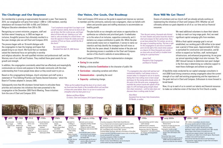
First Unitarian Church of Dallas brochure
Inside and outside of trifold brochure introducing First Unitarian Church of Dallas’s Capital Campaign. The image on the inside gives an overview of the church history and growth.
Housing Crisis Center logo
Logo designed for Housing Crisis Center, a non-profit organization. The mission of the Housing Crisis Center is to prevent homelessness and to stabilize those at risk in decent, affordable, and permanent housing, and to empower them to solve their own housing problems […]
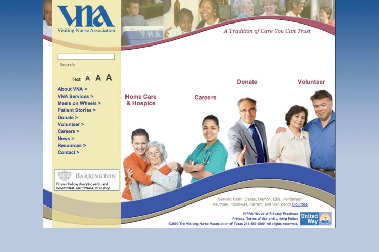
Visiting Nurse Association Website
After serving as VNA’s webmaster updating the previous website, VNA asked Kim Schlossberg Designs to manage the website redesign project. We began with getting input from VNA personnel in all relevant departments: development, fundraising, public relations, events, volunteer management, clinical, […]
Everything I know about website design I learned getting my interior design degree.
Well, not everything, but a really good foundation. Of course there are the obvious elements of any fine arts education – balance, rhythm, contrast, color theory, focus – what we learned in “Two-Dimensional Design 101.” But I was taught that […]
PC Momma logo
PC Momma offers on-location technical support and training for individuals and small businesses. The client wanted the logo to portray a warm, friendly, approachable personal service – almost grandmotherly. We chose the cross-stitch motif to communicate this message and to […]
Restoration Hardware Gives Print a Bad Name
I just received a 17 POUND, 13-volume catalog from Restoration Hardware! Unsolicited, or course. Don’t get me wrong – I love print and paper. But like anything, it can be used responsibly or irresponsibly. Funny thing – they wasted an […]
Red Oak Financial logo
Logo design for a financial services firm that provides excellent service, helps their clients achieve their goals and develops a long-term, trusting relationship with them.


