Graphic Design Helps Symphony Audience Understand Music

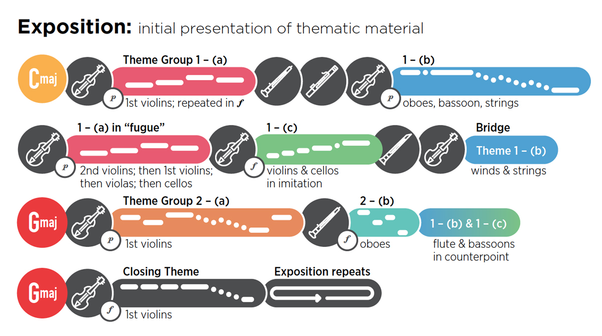
If a picture paints 1,000 words, how many musical notes can be communicated in a graphic? Here’s a really creative way to help people understand and better enjoy symphony music. I would love a guide like this, created byHannah Chan-Hartley, when I’m at the symphony.

This article from Creative Review was very popular on our Facebook page. Read article.

How the Toronto Symphony Orchestra uses graphic design to guide its audiences though its music
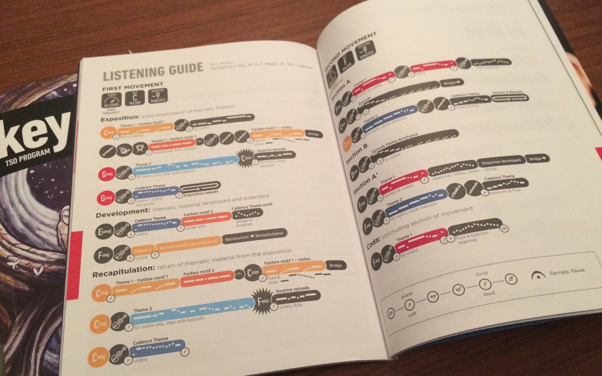
First two pages of listening guide for Mozart’s Symphony No. 41 in C Major, K. 551 ‘Jupiter’. Photo: Hannah Chan-Hartley

First two pages of listening guide for Mozart’s Symphony No. 41 in C Major, K. 551 ‘Jupiter’. Photo: Hannah Chan-Hartley


Detail from listening guide for Mozart’s Symphony No. 41 in C Major, K. 551 ‘Jupiter’

Detail from listening guide for Mozart’s Symphony No. 41 in C Major, K. 551 ‘Jupiter’

Kim Schlossberg
Follow me
Latest posts by Kim Schlossberg (see all)

About the Author

Kim Schlossberg created Kim Schlossberg Designs to help businesses and non-profits refine their messages and get them out to the right audience, in a clear, consistent, and integrated way. She provides strategic planning, execution and coordination of marketing, branding, and design by developing a deep understanding of clients’ businesses and their goals, and serves as a trusted advisor to help them grow their businesses and brand. Kim speaks to business and non-profit groups about marketing and related topics, and publishes a well-received (but slightly irregular) newsletter.

Author Archive Page