The Precarious State Of Logo Design
Fast Co.Design |DIANA BUDDS | 3.08.16
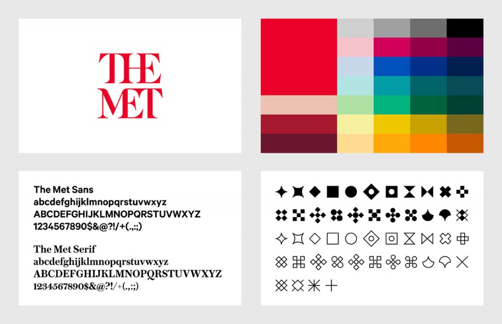
Three weeks ago the Metropolitan Museum of Art—known colloquially and now formally as “the Met”—unveiled a new logo and identity system designed by the international firm Wolff Olins. The response from critics was swift and fierce. Influential typographer Erik Spiekermann harped on the logo’s proportions and “forced curvy shapes”; New York Times critic Michael Kimmelman accused the museum of pandering to younger audiences; and Justin Davidson, of New York magazine, compared it to a typographic bus crash. Ouch. MORE
Latest posts by Kim Schlossberg (see all)
- How 2020 can make 2021 better - December 28, 2020
- Welcome to the Kim Schlossberg Designs newsletter - December 18, 2020
- A Strong Brand is the Key to Resilience - April 10, 2020
