When is it time to rebrand?
If you’re considering rebranding your company, as with any marketing or design project, the first thing to ask yourself (or your client) is “Why?” In this case, “why do you want to rebrand?”
There are some really good reasons to change your brand that will help move your business forward. However, answers such as these – by themselves – are not good reasons to change an already effective brand, and may do more harm than good when you consider a potential loss in brand equity:
- The company has been living with it for too long and became bored with it.
- New leadership wants to put their own mark on the brand.
Ok, so when should we rebrand?
Your brand is the total of how the public experiences your organization, as we discussed here (see Answer these 10 Questions to Build a Powerful Brand). So it makes sense to update or change your brand if what you’re using no longer expresses what your organization stands for – or if it never did. Usually we rebrand for one of four reasons.
The organization doesn’t have branding that effectively tells their story.
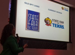 I recently heard Jennifer Schuder, Senior VP of Marketing for The State Fair of Texas talking about their rebranding at a DFW Chapter of the American Marketing Association meeting. The previous logo used an Art Deco style font – a nod to the style of the historical buildings at Fair Park. And it emphasized “State Fair” over “Texas,” even though every state has a state fair. Everyone knows that Big Tex is the highlight and most identified icon of the State Fair of Texas. So they rebranded to focus on Big Tex, and to emphasize Texas over State Fair. This was a necessary, meaningful and very effective rebrand.
- Southwest Airlines rebranded two years ago, with a whole new identity that emphasizes the company’s focus on having a heart, that is present in all that they do. Their former identity was pretty dull – it didn’t really tell the Southwest story. Read about it and see samples of the branding at work here.
Something in the company changed, and the original brand no longer communicates what they do.
- Over the years, International House of Pancakes started adding more and more diverse menu items, and they began to feel like their name no longer reflected what they offered. So they changed their brand to IHOP, and launched a new logo last year, with a happier look than the previous logo.
- Federal Express rebranded to FedEx in response to two things – they acknowledged the name that the public affectionately used for their company, and they acknowledged that they expanded their service beyond the original overnight concept.
- Mastercard recently gave their logo a makeover, simplifying it to work better on visual and on a very wide range of usages. It downplays the word “card” in the name, acknowledging the expansion of their business away from cards and towards digital. Read about it here.
Something in the world changed and the original brand is no longer perceived as positively as it was.
- When people started thinking that fat and fried food were “the enemy” in their battle against obesity and poor health, Kentucky Fried Chicken changed their name to KFC, although they are still using both names. I guess we’re supposed to forget what that “F” stands for. The rumor was that they couldn’t use the word “chicken.” The website story about the name change doesn’t acknowledge either of those reasons.
- Similarly, the Campbell Soup kids lost weight and Betty Crocker modernized her look so we wouldn’t think their brands were fattening or dated.
- Consumer Reports recently changed both their logo and their ratings to make them more universally intuitive. They didn’t mention this in their explanation of the changes, but the original black and red symbols were very well designed for a less expensive (at the time) 2-color printing process. Now that they are using 4-color printing for the entire magazine (and putting so much emphasis on the website), there’s no reason not to use a large palette of colors.


A public relations crisis that the brand doesn’t know how to get away from.
- Phillip Morris changed their parent company name to Altria when they got in trouble for misleading the public about smoking causing cancer.
- British Petroleum changed their branding to BP with a bright sun logo after the Gulf of Mexico oil spill. These companies thought a “clean slate” would help their reputations.
Any of these factors need to be balanced against the existing brand equity, or good will that the public has for the current branding. All brands have a brand equity that to some extent will be compromised with a rebrand. The company should carefully balance the costs and benefits of sticking with what they have vs. changing the brand. Very often, a minor brand “refresh” or “makeover” will maintain the existing brand equity for consumers while providing the fresh new look the company wants, and solving any technical or other problems at the same time.

- How 2020 can make 2021 better - December 28, 2020
- Welcome to the Kim Schlossberg Designs newsletter - December 18, 2020
- A Strong Brand is the Key to Resilience - April 10, 2020
