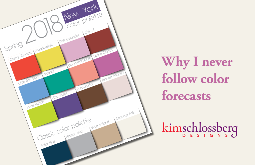
For the record, I had purple hair more than a year before Pantone named “ultra violet” the color of the year.
Along with giving graphic designers and printers tools to accurately specify colors, Pantone has been predicting color trends for as long as I can remember, in the fashion and design industries.
A lot of their trends seem to be on target. Or – are they really just self-fulfilling prophecies? If everyone reads that “this is the year of purple” and we start seeing purple everywhere, which is the chicken and which is the egg? Does Pantone (and others who predict color trends) find which way the parade is going and run out in front? Or do they tell us all which colors to use, and we blindly obey?
I can see buying a trendy piece of clothing, or a fun accessory in a trendy color. But I strongly recommend against using a super trendy color for something that you expect to last a long time, such as your company’s branding, or your household appliances.
I grew up during the “avocado green” era. If you missed that trend – you can experience it here – enjoy!
There is nothing that will make a design look dated faster than using the “color of the year” from a few years back. I would never encourage you to choose a safe, boring color. But I would encourage you to choose your color palette based on colors that communicate the message you want to get across, regardless of current trends or fashions.
If you want to learn more about what colors mean, with a little dose of current trends, check out my color inspiration board on Pinterest.
- How 2020 can make 2021 better - December 28, 2020
- Welcome to the Kim Schlossberg Designs newsletter - December 18, 2020
- A Strong Brand is the Key to Resilience - April 10, 2020
